— Musings —05.14.2013 04:04 PM
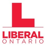
Worst. Logo. Ever.
Oh my Lord, this is awful.
The old Ontario Liberal logo was amazing – creative, eye-catching and full of meaning. It was also the product of a lot of consultation and research.
The new logo, dropped from on high, is terrible. Bland, boring, blecch. I sure don’t see candidates wanting to send in big cheques for new signs bearing this thing.
Anyone agree? I loved the old one, and hate the new one. You?


At least the L is situated on the forehead of the logo.
LOL!
In this version it looks like the L is hitting a wall … not the greatest visual. I don’t dig it. http://www.ontarioliberal.ca/NewsBlog/media/NewLogo_bighorizontal.jpg
Why do i have a sudden urge to play Tetris?
Doh ! beat me to it. That’s exactly what I thought.
Beat me to it too.
Do do do do do do do do do do….
Exactly! I was looking at it and it was reminding me of early early Simpsons episodes.
It looks directly like a UK or Ireland “Learner Permit” sticker that must be put on the windshield of any new driver over there! Not a good message to send!
http://www.design-kompany.com/news-at-dk/interesting-finds/2371/
I liked the old one better. Incidentally, I also hate the new “Ontario” logo introduced a few years ago. Luckily in Kensington I I found a Tshirt with the classic Ontario logo on it and wear it with pride.
Exactly what I thought of when I saw it
This is so unrelentingly awful that it must be a bait and switch gambit to retain the old one and get some earned media.
Builder’s square, ski-boot, fornicating bricks, rookie driver’s sign?
Do I detect 2 shades of red (a printers’ nightmare).
Did the party really need something that uses so much red ink?
Marketing 101… don’t make it EASIER for your opponents to mock you with your own logo… https://dl.dropboxusercontent.com/u/2522494/OLP%20Cancelled.jpg
The modern fascination with graphic design is borderline pathological. Seriously. It’s a logo. By definition, you cannot get more superficial.
That aside, it does remind me of the “L” stickers that novice drivers in the UK are forced to apply to their cars.
Doesn’t matter.
Wynne is going to lose the upcoming election and resign. Then the party, under a new leader, will have 1 to 4 years to pick a new logo.
It doesn’t MEAN anything.
The moment I have to ask “what does it symbolize?” is the moment it’s a fail.
‘L’ for Loser when people use to use their thumb and index finger on their forehead….not a good logo – hope they have not printed business cards yet!
um, it is a fucked-up, plunked down, squat, red, DOWNWARD arrow. Excuse the caps. And excuse me, I’m off to consult the wife about quashing our donations. There are plenty of other good causes out there right now (including the federal party.)
Stealth Bomber, flying diagonally.
Quite diabolical, actually.
It looks like an elementry school student’s first attempt at blocking in a letter of the alphabet.
It’s kinda Soviet. And I don’t say that lightly…
Just what I was thinking. Neighbour’s kid did an art project to protest “concept” using Soviet letters – “KONCEPT” and it reminds me of that. “Soviet Posters – Iconography of Power” – maybe that’s the reason for the L, looks more powerful.
It’s awesome! I think we should start a contest!
Sorry, it is nowhere near as bad as this one that came out a few months ago. In Alberta we can always do better at destroying the brand then anyone.
https://www.albertaliberal.com/Downloads/300%20x%20109%20Reverse.png
Going to disagree with you all here. Honestly the new one looks like it came from the same firm that created the SANDRA logo.
I also like going back to traditional Liberal Red and away from the cranberry red.
The trend now is away from 3D wet bubble graphics and moving towards more 2D & flat (think itunes vs new windoz logo) .
The old OLP logo was crap, it looked like an ad for EXLAX or a mutual fund ( double entendre intended). I always thought the old one should be at the beginning of a commercial that starts “oh It’s Dalton, & he just bought life insurance!”
For what it’s worth
Best 3 political Logos:
The communist party
The PQ
Solidarity (Solidarność)
Worst 3
The Canadian Alliance (seriously WTF WAS THAT?)
The NDP (1970’s & 80s) (I know it was the 70’s but brown on brownie orange?)
The Alberta Liberal Party (1970’s-1984) (Hey, they had NO money)
As a francophone, the first thing that jumps out at me is no accent on the “e” making it an English-only term. As a life-long supporter, I find that insulting.
My gal spotted that, too. And she’s not even bilangue.
Let’s try again. Please check out http://www.ontarioliberal.ca/fr/ – There have always been two logos, an English one and a French one, and there still is.
Not very creative.
Plus, shouldn’t Ontario be before Liberal?
Having Liberal first in bold, and twice the size of Ontario like that gives the impression they feel superior to the rest of us, like their party is more important than the province.
That won’t help with the feeling a lot of Ontarians have the Libs has become arrogant and self absorbed.
But, thats just me.
Gad… that one I thought was bad, but not totally inexcusable, it’s lame but it does look like a factory or some kinda nondescript industry-like jobs-creating building sitting happily in the red horizon of a soon-to-be rising sun of a new day.
But then I looked at the OLP website.
and the version on the header there looks like an L going full speed about to slam into a brick wall immediately to the right. God forbid.
One of the few advantages of re-running / appointing the same candidates that lost in 2011 was that their Signs ready and waiting for the coming election. With the new Logo, that erases that advantage. Reading the comments submitted, ranging from “Learners Permit” to “Loser”, I couldn’t agree more that the new Logo is mistake. They could have gone with a Giant Red W for the Wynne Liberals – actually – if you put the two L’s together on a 45 degree slant, guess what – “W”. 45 degree slant – slippery slope for sure!
One is left to wonder what the ones didn’t get selected look like.
If I lived in Ontario, I too might have wanted to see the red maple leaf dropped from the Liberal logo after the Leafs choked last night.
It’s not even the right shade of red is it. It’s more pink and some purple when you look at it quickly.
It’s not easy to look at actually, which may be a good thing.
I invite you to take a look at our New Brunswick Liberal Party logo. It is relatively simple, respects both linguistic communities and, in my opinion, is a pleasing design. http://nbliberal.ca/
I like it.
On the level and on the square
I loved the old logo with Red Green and his minority friends up at Possum Lodge.
This looks like the kind of crap a committee would spit out after 9 hours of debating and someone said “Enough already, just f%&king approve something!”
Candidates will just use the old logo on a lot of signs, as they usually do when the Borg Collective comes up with something as silly as this.
This is aweful. By emphasizing the “L” they’re setting themselves up for so much ridicule. The first thing I thought when I saw this was “LOSER!” and I’m generally a Liberal supporter.
Suspect any recent arrivals from the UK and Ireland will take one look at it and think ‘L Plate’: http://en.wikipedia.org/wiki/L-plate Which probably isn’t the reaction you’re after when you’ve only been in the job a couple of months.
I agree with Marc-Andre – the NB Liberal works – it clearly says Liberal with a progressive feel. The Ontario L looks like something from Mindcraft.
Google learner permit plate, England, and you’ll pretty much see the new Liberal logo.
If I were the other side, I’d be having some serious fun with this.
For the new era, they could have had the creativity to do a visual pun with the L, the trillium, and a pair of granny glasses…
I think the Laverne “L” would have been a better design.
Even the Russian “Л” (L) would have been better.
I quite like it. Contemporary, clean, timeless. Their last OLP logo wasn’t even readable at small sizes. There were photos IN the logo… terrible idea.
Kinda liked the burgundy red in the last logo, but this bright one will work well too.
Personally, I don’t really care. I vote on policy not logo or brand. If I did I would be voting for Coca-cola for most reconizable and popular.
I don’t know if anyone’s mentioned this yet, but it kinda looks like the profile of a power plant. Yikes.